Two basic charts about debt in the UK
This section contains the CC2 graphs created on the Economics Observatory Data Hub
Chile's strategic mineral reserves position it as a critical supplier for global energy transition, controlling significant copper and lithium resources essential for clean technologies. Copper mine production by country shows Chile as the world's largest mined copper producer (~5M tonnes a year, representing 21% of global production in 2025).
Furthermore, lithium production by country positioned Chile as the second-largest lithium producer (25% of global production in 2023)
Takeaways: Chile has a crucial role to play in the global energy transition, dominating two critical energy transition minerals, copper for electrical infrastructure and lithium for batteries, cementing its role as indispensable to global decarbonization efforts.
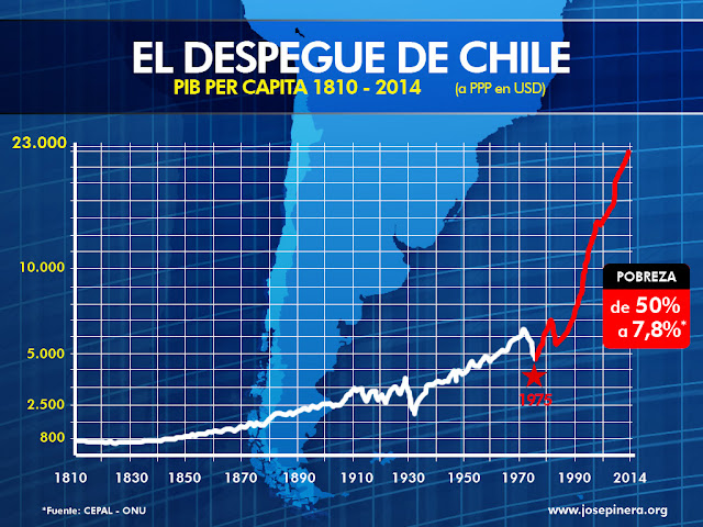
The original graph uses two tricks to exaggerate Chile's economic performance. First, it shows Chile in isolation—without peer comparisons, any upward trajectory looks impressive. Second, it uses a linear scale, which visually inflates recent growth into a dramatic spike. A logarithmic scale is the proper choice for comparing growth rates, as equal distances represent equal percentage growth. When corrected, Chile's "miracle" looks far more modest.
This chart adds context with four peers. South Korea started poorer than Chile in 1970 yet achieved 12× growth—proving far more dramatic transformations were possible. Argentina, richer in 1970, stagnated at 1.5× growth. Spain and Portugal, with similar democratic transitions, achieved 2.7× growth via EU integration. Chile's 3× growth outpaced Latin America but fell short of Asian tigers and only slightly exceeded Southern Europe. The improved visualization uses a logarithmic scale, adds peer comparisons and removes distracting imagery.
The World Bank API uses the base URL https://api.worldbank.org/v2/ followed by the endpoint structure /country/{country_codes}/indicator/{indicator_code}. Country codes are ISO-3 codes separated by semicolons (e.g., WLD;EUU;NAC for World, European Union, and North America). The indicator code specifies which dataset to retrieve (e.g., EG.FEC.RNEW.ZS for renewable energy consumption). Query parameters include format=json for JSON output, per_page to set the number of records, and date for the year range (e.g., 1990:2022). The full URL used in the chart is:
https://api.worldbank.org/v2/country/WLD;EUU;NAC;EAS;LCN;SSF/indicator/EG.FEC.RNEW.ZS?format=json&per_page=500&date=1990:2022
Note that the API returns a two-element array where index [0] contains metadata and index [1] contains the actual data, so in Vega-Lite you must use "format": {"property": "[1]"} to extract the data correctly.
I scraped Chilean football league data from El Mercurio using BeautifulSoup and pandas, extracting standings and match results, then transformed them into cumulative points datasets for visualization. You can find the Python code here.
Coquimbo Unido dominated the 2025 Chilean league, securing the title with 71 points after an extraordinary 19-match winning streak. Universidad Católica (55 pts), O'Higgins (53 pts), and Universidad de Chile (51 pts) are competing for the remaining two Libertadores qualification spots. At the bottom, Deportes Iquique (24 pts) and Unión Española (21 pts) face relegation.
Six economic indicators from the Federal Reserve (FRED) API, downloaded using Python loops and displayed using a JavaScript loop. View Python code.
Shown below are three electoral maps. First, a choropleth map showing the results of the Scotland General Election 2024 by constituency. Second, a coordinate map describing the seats obtained by each party. Finally, a choropleth map displaying the General Election results in Wales, utilizing Mapbox to enhance data interactivity.
This visualization was created using microdata from the Long Run Prices Database (LRPD), specifically item 310315 (bottle of wine 70-75cl). The original dataset contains 136,455 individual price observations collected from 309 shops across 12 UK regions between February 1994 and September 2024. For each month, I calculated summary statistics including the mean, minimum, and maximum prices observed. The data was then sampled at regular intervals to create a cleaner time series while preserving the overall trend. The resulting chart displays the mean price as a line, with the shaded area representing the full price range (minimum to maximum) observed each month.
Starting from a dataset of 49,070 individual price observations for 30g hand-rolling tobacco packs collected across 12 UK regions between 1996 and 2024, sourced from the Long Run Prices Database (LRPD, Davies 2021), I aggregated the data by year to calculate the annual average price, then computed the year-over-year percentage change for each year — resulting in a simple 29-row dataset with two key metrics: average price (£) and annual change (%), which form the basis of this scrollytelling visualization.
UK Regional Income & Productivity
Chilean Election 2025
Life expectancy vs. GDP per capita, 2023. The period life expectancy at birth, in a given year. GDP per capita is adjusted for inflation and differences in living costs between countries.
Model: Life Expectancy = 23.45 + 11.93 × log₁₀(GDP per capita)
R² = 0.736 means that 73.6% of the variation in life expectancy is explained by GDP per capita.
Slope: 11.93 (95% CI: 10.92–12.94, p < 0.001) — a 10× increase in GDP per capita is associated with ~12 additional years of life expectancy.